El 15 de Julio de 2015, The Dieline publicó un artículo sobre nuestro nuevo packaging. Lo que comenzó siendo en el 2007 un blog personal muy pronto se
convirtió en una plataforma dedicada a definir y promover los mejores diseños de packaging del mundo y proporcionar un lugar donde la comunidad de diseño mantenerse informado de las últimas tendencias y proyectos que se están creando en este campo. En poco más de 2 años, The Dieline se convirtió en el sitio más visitado de diseño de packaging en el mundo, captando millones de lectores que abarcan cientos de países.
Por ello son una fuente de inspiración de la industria para el diseño de packaging, por lo que nos sentimos muy orgullos de haber captado su atención de este modo al hablar así de una marca como CONFORTEX:
“Brillante, audaz y contemporáneo, esta línea de Preservativos de Confortex está segura de captar su atención en las estanterías. Con un innegable y atrevida combinación de colores y patrones atractivos, ha creado un diseño fácil de detectar que adopta un enfoque positivo y divertido para un sexo seguro“
Confortex Condoms – The Dieline. Bright, bold, and contemporary — this line of condoms from Confortex is sure to catch your attention on the shelves. With an undeniably daring color scheme and attractive patterns, The Woork Co. has created a design that that is easy to spot and embraces a positive and fun approach to safe sex.
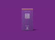
“Confortex was the very first brand to include instructions within their foil unitary packaging, and we thought that was a very cool differentiation to use as a base for the new brand. The logotype symbol is framed as that foil unitary condom package that made them different. For the packaging system we established a reduced color gamma, two base colors and one accent, and we created pattern based designs for each variety box to make them totally unique and memorable, to assure a wide variety of possibilities for the brand’s future products and of course to differentiate from their competitors on the store display.”
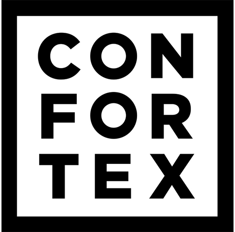
The number one goal for Confortex is listed right at the top of their packaging: “Feel Safe.” While still focusing on the consumer’s main priority, The Woork Co. has managed to give the condom brand a playful appeal. The Confortex logo is a square, identical to the shape of the product inside. Each condom features the same pattern as the box, with the name of each variety written on it as well. The repetitive and vibrant patterns give Confortex a modern feel, an imperative quality for buyers to feel comfortable placing their trust in a company, especially when it comes to their health.